|
Re: Velocitron Speedia 500 Collection Voyager Override In-Package Image
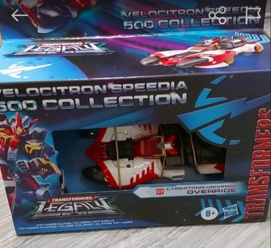
The packaging is so lazy. The design of it is just terrible, graphics-wise. The images are so awkwardly placed, it's distracting. The car on the top flap and the car on the top of the box look like they're going to drive into each other. I can't tell which one is a product picture, and which is an artist's rendering, neither are exciting to look at.
The negative space is atrocious. The Robot image gets lost, and is way too small. You really have to stare at it for a while to realize that it's actually a transformer.
The backside is no better, barren and lazy. There's no text describing the character or the story behind anything. It's literally the same two pictures, and that's it.
I admit, I'm no too familiar with the term Speedia 500, but the Title text block is so bad. To me, it reads as Velocitron Speedia and then 500 Collection. I thought at first this was for the Spanish market with the word Speedia on there.
With the exception of a couple of chevrons, there's nothing to show that the car goes fast. More streaks and go fast artistic flare is needed. I don't know which direction anything is going.
There's just so much going on, that it's distracting, and nothing stands out.
Compared to the standard Legacy packaging, this is utter garbage. Looks like a knockoff that's trying to hard.
Also, I've seen the Velocitron Green Hauler packaging, and have to question, how fast does a crane truck go? Such a lazy repaint to be included with the Velocitron subset.
BTW: Thew agrees with me.
If it were me (and I am actually a graphic designer), I would make that robot image huge, have it stretch out over the top of the box, and up the back flap part. That way, at least you know you're buying a robot that turns into a car. Have the robot image standing behind the car mode. Make a transformers logo more prominent (the 1 logo down the side of the front of the box doesn't cut it here), and the Legacy logo should be more connected to the Speedia 500 text.
Maybe make the whole packaging look like the car is on a race track. I don't know why the box is so square, when all the other packaging has been so angular.
They missed such an opportunity with this packaging design. It's just a big block box with a hole cut out and some stuff to fill space.
|